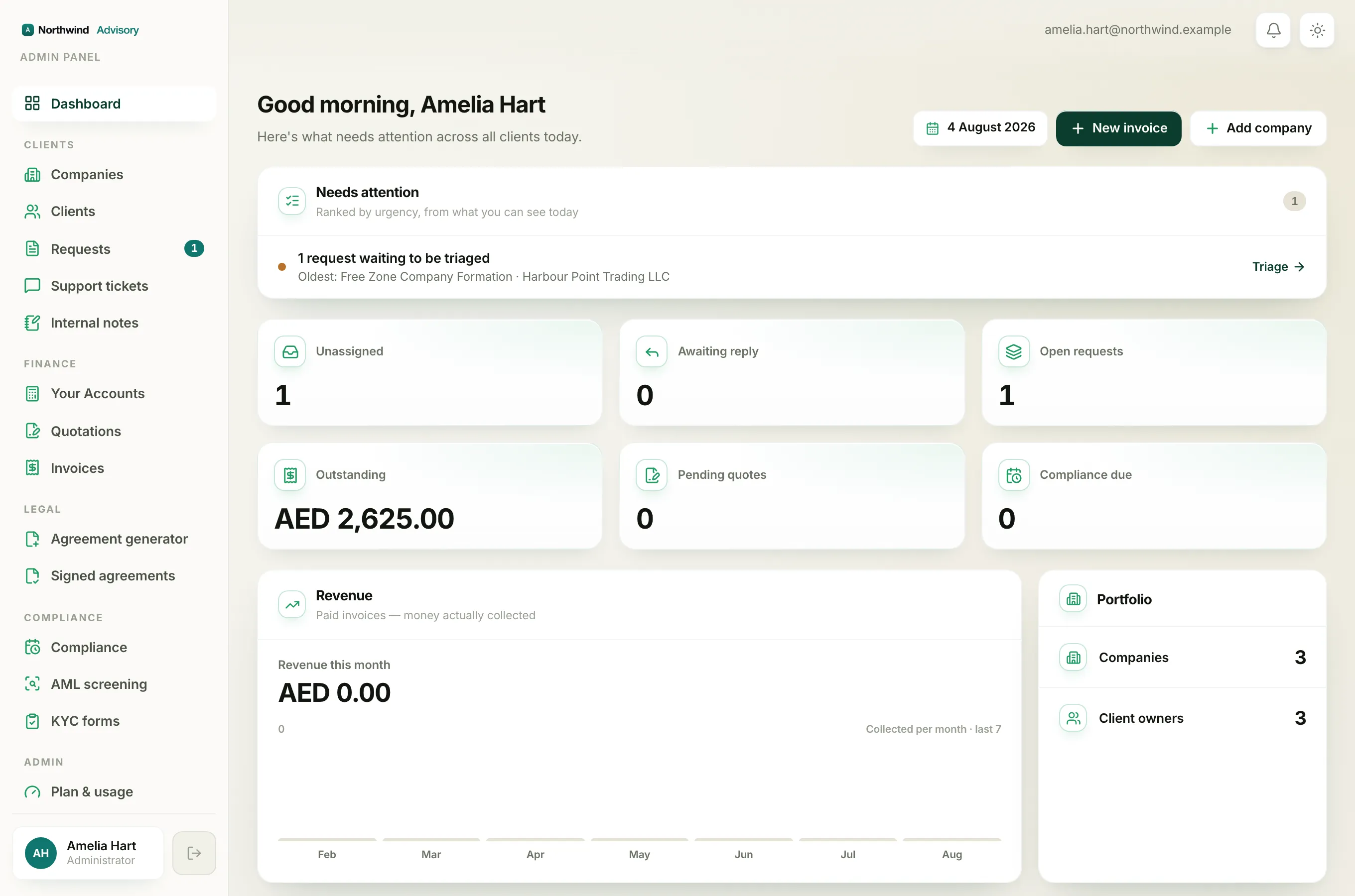
Lower down on your Dashboard, in the Revenue card, is a bar chart of your firm's income. It is a simple, honest picture of the money you have actually banked, month by month. This article explains exactly what it counts, because "revenue" can mean different things and this chart means one specific thing: cash collected.
Where to find it
- Log in to your workspace.
- In the left menu, click Dashboard.
- Scroll down to the Revenue card. It sits next to the Portfolio card.
Note
The Revenue card only appears for team members who are allowed to see firm income. If you do not see it at all, your role does not include revenue access, and that is by design. See Why your dashboard differs from a teammate's.
The big number at the top
At the top of the card is Revenue this month, a single large figure. It is the money collected so far in the current calendar month. It moves up only when an invoice is actually paid, never when one is merely sent.
The bars
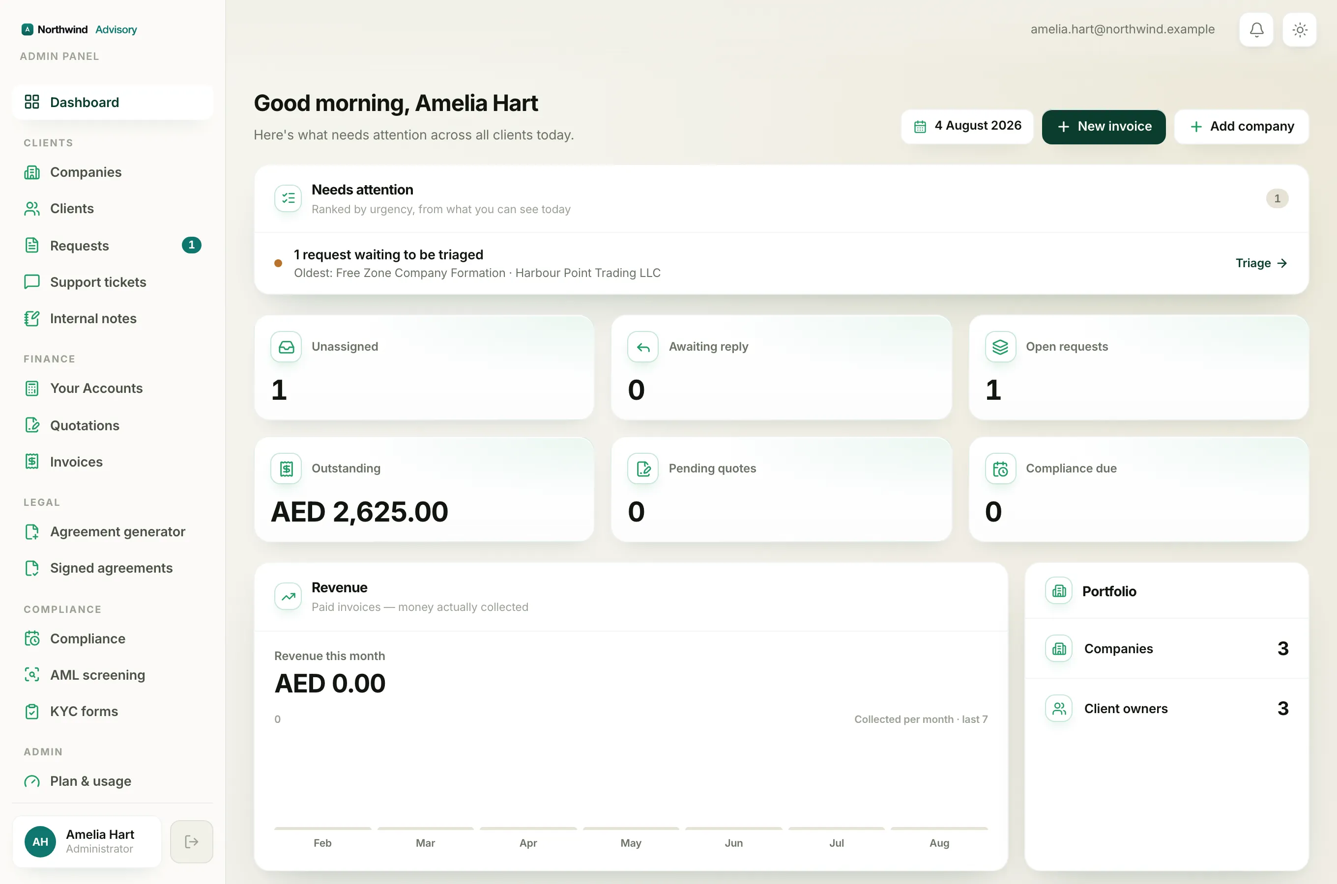
Below the number is a row of bars labelled Collected per month · last 7. There is one bar for each of the last seven calendar months, including the current one, oldest on the left and this month on the right.
- The height of a bar is the money collected in that month.
- A green bar means money came in that month. A month with nothing collected shows only a tiny flat stub, so you can still see it sat at zero.
- The small figure in the top-left of the chart is the value of the tallest bar. It is the scale, so you can read roughly how big the other bars are against it.
- Hover over any bar to see the exact month and amount.
Important
The chart counts money by the date it was paid, not the date the invoice was raised. So if you record a payment today against an invoice you sent last month, it lands in this month's bar. Recording a payment is what moves these bars. See How to record a payment.
What the chart deliberately leaves out
- Unpaid invoices are not here. Only paid invoices count. What clients still owe you lives in the Outstanding number card, not on this chart.
- It is your fee, not the government's money. The bars show your net professional fees. Government pass-through charges and the 5% VAT you collect for the tax authority are stripped out, because that money is not your income. This is the same basis your Accounts revenue reports use, so the figures line up.
- Months with no income are still drawn. Empty months are left in rather than hidden, so the shape you see is the true shape of your income and not a flattering crop.
Why the chart might look flat or empty
If the bars are mostly stubs, it usually means few invoices have been marked paid in that window. Sending an invoice does not move the chart. Only recording the payment does. Once you mark an invoice paid, its value appears in the bar for the month you recorded it.